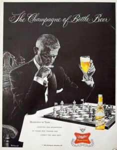
The image below can be found easily on the net. It is apparently from an advertisement campaign for Miller beer from, I think, the end of the fifties. The slogan of the campaign, not just this particular ad, was apparently the champagne of bottle beer. Obviously, their beer is ridiculously expensive, fizzy, and made from grapes. The other lines aren’t any better:
Ad: Distinctive in taste…
That’s probably also true of potatoes marinated in banana juice.
Ad: Accepted and appreciated by those who demand and expect the very best.
That’s the most clunky thing I have read in a long, long time. Also, those people probably ‘accept and appreciate’ pigs, but they sure as hell aren’t going to drink them.
But there are stranger things going on here. For example, where is this scene taking place? There is a painfully white tablecloth, which suggest perhaps a restaurant, but why would this guy be playing chess in a restaurant? There’s no room left for food! A very fancy tournament? No, there’s no clock. At home, maybe? Perhaps, but that’s a mighty uncomfortable-looking chair and some mighty fancy attire for indoors at home. But the weirdest thing is the bottle. Clearly, the table is at an angle, so how is the bottle standing flat?
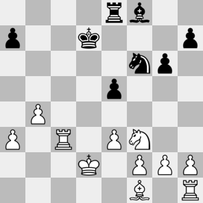
And he is also using very strange pieces. Luckily, it is very obvious which pieces are pawns, knights, rooks, and kings. Unluckily, it is not so clear whether the pieces on f1 and f8 are queens or bishops. Given their position, I assume the latter, which gives rise to the following position:1
 Unfortunately, the bottle is blocking part of the board and I suspect there might be black pawns hiding on f7 and b5 or something, and possibly even a black rook on, say, e7. But this could very well be wishful thinking. Or perhaps a conscious decision by the artist to hide part of the position, to avoid being sued by insulted chess players. Although they would pass the Miller test.
Realism: 3/5 All pieces are on logical places, but I nevertheless have some questions. Mainly about the bishops apparently remaining in place on the f-file and the white rook on h1 having a nice cuppa while watching proceedings from its quiet little corner.
Probable winner: This depends heavily on how many black pieces have fallen victim to alcohol.2 If there really are a black rook and two pawns missing in the diagram, it might be drawish. Otherwise, white is winning.
1. [This link gives rise to diagrams.] ↩
2. [Is this symbolism? Is this ad making some statements about alcohol abuse in the African American population?] ↩
